If you’re getting the impression that I’m just hopelessly stuck on myself, well, I hope you’re wrong. Can’t swear to it. It’s just that I’ve put a lot of time and energy lately into preserving the work that a lot of people, myself included, did back in the 1970s and 1980s, and so I’m thinking of a lot to say about it. And, yeah, I think our work deserves to be remembered. So there it is, and here’s a rundown of the artistic effort that went into making my first fanzine, lo those three decades ago.
Fanzines in the 1980s had amazing artwork, not always done justice by the printing technologies fan publishers were forced to use. When I decided to publish my own zine in 1984, I wanted it to have its share of artwork. Being a one-man-show, I had to provide my own. Fortunately, in those days, illustration was something I did. I’d also worked on the school newspaper and yearbook, so I was comfortable with publication design.
For the zine’s cover, I couldn’t afford color. I was publishing on my parents’ office Xerox machine! So I xeroxed a photo of the Enterprise (I think from the STTMP Souvenir Program Book center spread), trimmed with scissors and pasted over the Starfleet Delta, which I formed with 4pt layout tape on thin graph paper:
I printed it on canary yellow paper. All copies with this cover were printed at home on my parents’ office copier, and all artwork was thus reproduced from the original by Xerox.
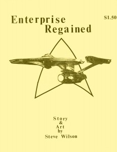 I did 25-50 copies of this one, and then my parents said “enough.” If I was going to mass-produce, I needed to do it right and go to a real printer. I pulled out the phone book and, appropriately, picked Galaxy Graphics to do my offset printing. They were going to halftone all my illustrations, so I designed a new cover.
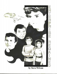 This is a scan of the original master for the second cover. I though it was better to emphasize the people, rather than the ship, and make it clear this was a Saavik story. This master used a half-tone of my original, which was charcoal. Haven’t found that artwork yet, but hope to, as the half-tone lost some of the detail. Copies with this cover have half-tones of my original pencils on the interior. I believe 200 copies were printer. Maybe 400?
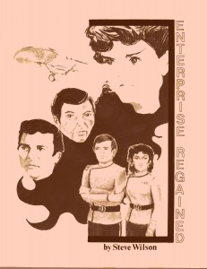 When that batch sold out, I decided the cover needed some color, so I made it tan. For this edition, to save money, I went with pen and ink for the interior illos.
And then the illos…
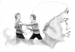 The first illustration I ever did of Kevin Carson (left) and Terry Metcalfe in their original Trek context. This was pencil on a page from my sketchbook. I later did a pen and ink version, tracing it on a light table. I was never as happy with that one. The smoky-looking constructs show the influence Richard Powers had on me at the time. I was so taken with his illustrations for Heinlein’s Number of the Beast.
 This two-page spread of Uhura and Chekov went across the opening pages of Chapter Four. I was a little baffled when I found the box of nearly all my zine illos, and these two weren’t there. I was even more surprised when I pulled the file of master pages for this zine after all these years and found the drawings had been done right on the master pages! My art teacher, Steve Perrine, taught me better than that! But I guess I was in a hurry. There are actually three sets of masters for this thing. I first typed on 8.5 x 11 paper with NO margins, then reduced those by 70% (the Xerox only did 94, 70 and 50, I think) to create masters for copying. When I went to offset and used half-tones, yet a third set of masters had to be created with the half-tones pasted on them. These were pencil on the characters, with the views of space behind them done in charcoal for extra contrast. Again, there’s a pen and ink version.
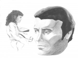 I was never happy with this drawing. Again drawn directly on the masters, and the Kirk head was actually cut and pasted in place. I have a vague recollection that there was another, botched Kirk head under it. Or maybe a figure of Kirk that actually fit in the scene. As it is, I decided pretty quickly that I thought the effect was just bizarre. I still like the drawing of Saavik in her robe, though. You’ll note that all the Saavik images are based on Robin Curtis, even though the story was written and the publication almost complete before she ever played the part. I took an immediate liking to her as Saavik. I think it’s a shame that people only seem to remember Kirstie Alley now. I’ve met and worked with Robin several times over the years, and she’s a fun and friendly person.
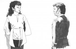 Since I wasn’t happy with the first, I replaced it with this one when I went pen and ink. A dubious trade-off, I think, since this isn’t nearly as nice a drawing of Saavik!

Looking back, it’s probably a mistake that there’s no illustration of Angela Teller. I think, had there been, a lot less people would have believed I had created the character for this story. She was, after all, the same lady who appeared in the episodes “Balance of Terror,” “Shore Leave” and “Turnabout Intruder.” I just always liked her, so I put her aboard the new Enterprise.


When you’ve done as much work in and with Fandom as you and your family have, you have every right to sound stuck on yourself from time to time! (Even though, I don’t think you do.)
It’s fantastic you’re spending the time and effort to preserve all this stuff.
If you ever need help, let me know!